Last year we introduced mobile templates on Blogger, and Dynamic Views for the desktop. Since then, over 2 million blogs have started using Dynamic Views on desktop, and users have asked us for more mobile features. So today, we’re bringing the speed and advanced reading experience of Dynamic Views to mobile. Configuring your blog to use a Dynamic View on mobile will result in a reading experience that mirrors the desktop, but is optimized for mobile.
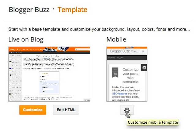
To configure a Dynamic View for mobile on your blog, select the "Template" tab, and then click on the settings cog under the “Mobile” preview.
If you’re currently using Dynamic Views on the desktop and have the “Default” mobile template selected, you don’t need to do anything -- your blog will automatically start using the mobile optimized view when viewed from a compatible mobile browser. For more information, see Blogger Help.
Currently, only the “Classic” view, which is best suited for small screens, will be shown on mobile. Tablets with large screens will get the full desktop experience. As with the older mobile templates, supported browsers are WebKit-based browsers (such as Android Browser, Chrome for Android and iOS, and Mobile Safari).
We hope your readers enjoy the modern, compelling experience that this mobile update provides.
To configure a Dynamic View for mobile on your blog, select the "Template" tab, and then click on the settings cog under the “Mobile” preview.
If you’re currently using Dynamic Views on the desktop and have the “Default” mobile template selected, you don’t need to do anything -- your blog will automatically start using the mobile optimized view when viewed from a compatible mobile browser. For more information, see Blogger Help.
We hope your readers enjoy the modern, compelling experience that this mobile update provides.


0 Response to "A more dynamic mobile reading experience"
Post a Comment